Timeframe: January 2023 → March 2023
Role: Project Manager for team of 4 (including myself) & UX Designer
Tools: Figma, Figjam
Overview
Google Scholar is a powerful search engine for researchers and academics to discover papers, books, and other materials. However, for beginner researchers, it can be difficult to find relevant papers. Furthermore, there are a variety of features that could be improved or added to make using Google Scholar seamless for all researchers and better accommodate all paper finding styles.
How might we streamline the paper-finding process on Google Scholar to make it more accessible for users of all backgrounds to efficiently find relevant papers?
User Exploration
Our interview goals were to understand:
- How do researchers typically search for papers?
- What are struggles researchers encounter when searching for papers?
- What are researchers' existing frustrations and desired features for paper finding?
Thus, we watched researchers' normal workflows in searching for papers and noted their reflections during a post task interview regarding their experience, frustrations, wishes and reasoning for using certain systems.
Common Trends
We found many common trends from each researcher's thoughts and feedback from the tasks. Overall, 8/9 researchers used Google Scholar in some capacity for searching; only Chris solely used Semantic Scholar.
Two professors (2/9) we interviewed had very similar workflows and thoughts. They both emphasized the importance of being able to quickly decide if a paper is reputable. Some heuristics included:
- Number of citations
- Venue the paper was published in (e.g. conference/journal)
- Familiarity with the author(s)' previous work
Another commonality was how some features were left untouched when searching, like filtering: everyone exclusively used key words to constrain their search.
Because our users had many different research backgrounds, they had a variety of searching techniques. For instance, Devamardeep, an HCI researcher, used conference sites and Google Scholar to find papers. He emphasized the value of curation that conference sites provide, encompassing a standard of peer review and paper categorization that made it easy to search for papers regarding that conference's specialization.
[The conference site] is really nice because this is a conference that I know, and so I know that there's going to be some standard of peer review.
Devamardeep, HCI researcher
On the other hand, he found Google Scholar more useful for tracing papers once reputable papers were found or for exploring related papers outside of conferences.
User Wishes
While our users had a process for finding relevant papers, many still mentioned features that would augment their search. Most commonly mentioned were having a curated content page and a visualization tool. 4/9 of our users, including professors and grad students, said that having a page with paper recommendations based on what they have read would help them find content they may be interested in. This was reminiscent of why Devamardeep would use conference sites: curation. Specifically, Eric mentioned TikTok's For You page:
Something [like TikTok's For You page] applied like that to research would be helpful; if I'm notified about this unknown researcher who publishes something relevant to this thing I'm reading about, that would be cool.
Eric, ML researcher
2/9 of our users mentioned that having some sort of visualization tool to show the level of relevancy between papers using a metric for a given paper would be helpful in identifying relevant content. Though there is a list of related papers for each paper, there is no measurement of how relevant the papers are.
Pivot
Our original redesign was focused on arXiv, another search engine that hosts new, open access papers. However, 8/9 researchers used Google Scholar, rather than arXiv. Furthermore, there was a large amount of criticism about arXiv, like how the searching had low relevancy, causing users to use the platform only as a paper repository.
I fucking hate this search. Like, this core recommender. It doesn't work… it sucks, it's terrible…I do not recommend arXiv. Honestly, I would not fix it. There are better solutions out there, why would you spend the time to try to fix it?”
Christopher, ML researcher
Thus, we pivoted to Google Scholar, as it was by far the most used platform while still having pain points that could be iterated on to achieve our goals of easy and relevant paper discovery.
Solution
User Flow:
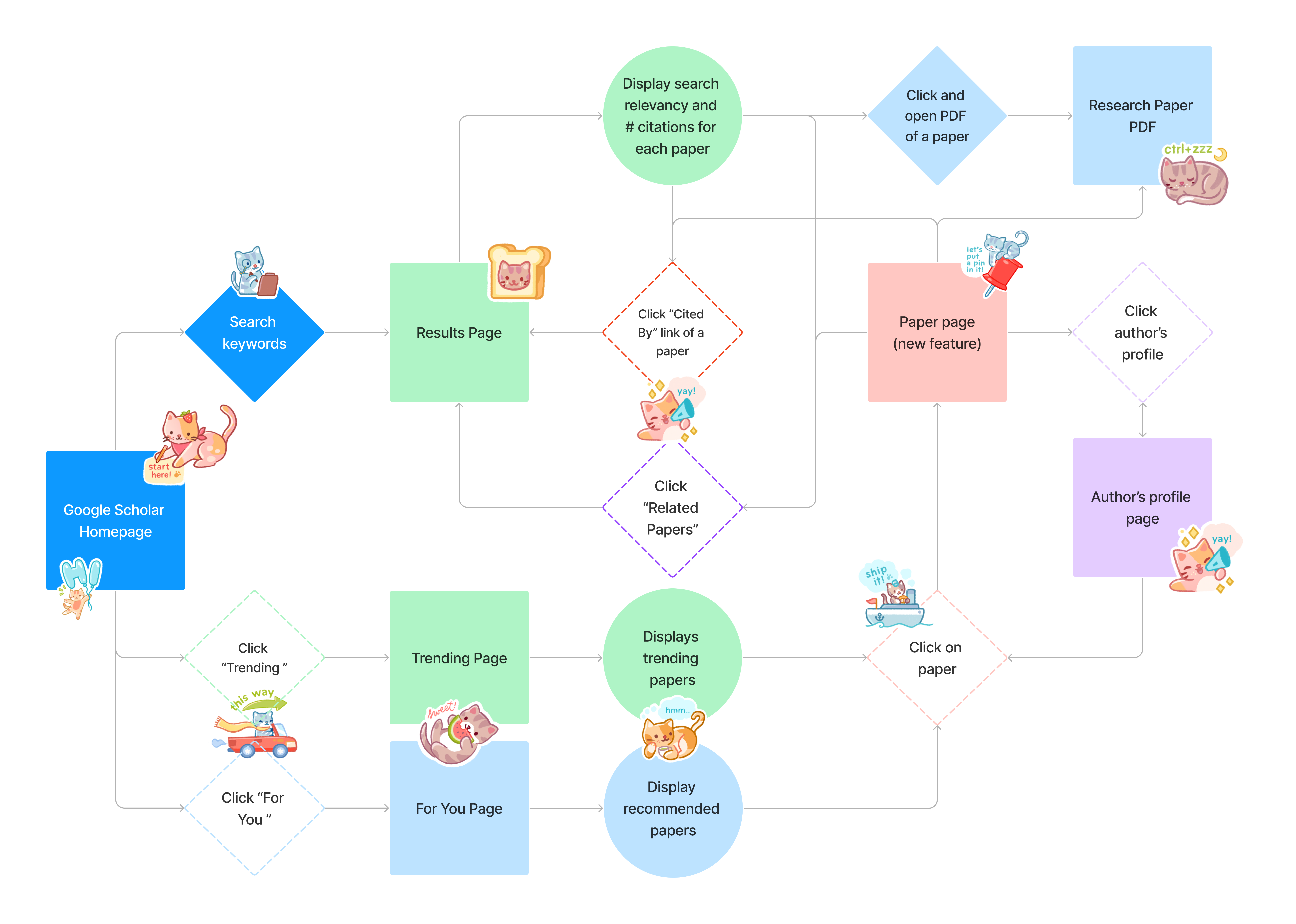
From our user interviews' insights, we brainstormed a variety of features we wanted to implement and how they would fit into the flow of using Google Scholar. For instance:
- Desire for curation → For You and Trending pages
- Desire for relevancy level → Match score to show how relevant a paper is to your search
- Lack of filter usage → Improved filters with more relevancy to finding papers
- Keeping user in Google Scholar for ease of information access → Paper page
Note: See Appendix for the pages
User Testing / Iteration
I conducted 4 user testing session for our hi-fi prototypes, leading to a multitude of changes from our original designs.
Conclusion
Through this redesign, I learned a lot about designing a piece of an ecosystem and figuring out when to take inspiration from other pieces of the design system or coming up with my own designs. For instance, on our home page, we started with our own cards, but ended up taking a lot of inspiration from Google News's home page cards. Finally, I conducted 15 user interviews, which taught me a lot about user experience studies.
Some of my management responsibilities included:
- setting up deadlines and feature priorities + dividing tasks
- writing meeting notes and scheduling meetings
- facilitating meetings and decisions for the redesign
Next Steps
For future iterations of this project, I would make some additions to the UI, such as adding breadcrumbs, as we have a lot of pages that lead to one another. It would be helpful to keep a trail of where a user has gone so they can keep track of what papers and authors they started on.
Also, I would spend more time discussing our color library with my team, as it felt like we were coming up with more colors as we went along. This was also hindered by the fact that Google itself has a large variety of blue shades that they use.
Finally, from a more technical perspective, I'd put more thought into how our algorithms would work for things like the For You page and exactly what elements we would pull from to decide what would appear for the user.
Thank you to my teammates Edward De Leon, Vivian Yan, and William Duan for being great teammates (and the snacks), and Megan Tan for all the help throughout the project!
Appendix of Pages
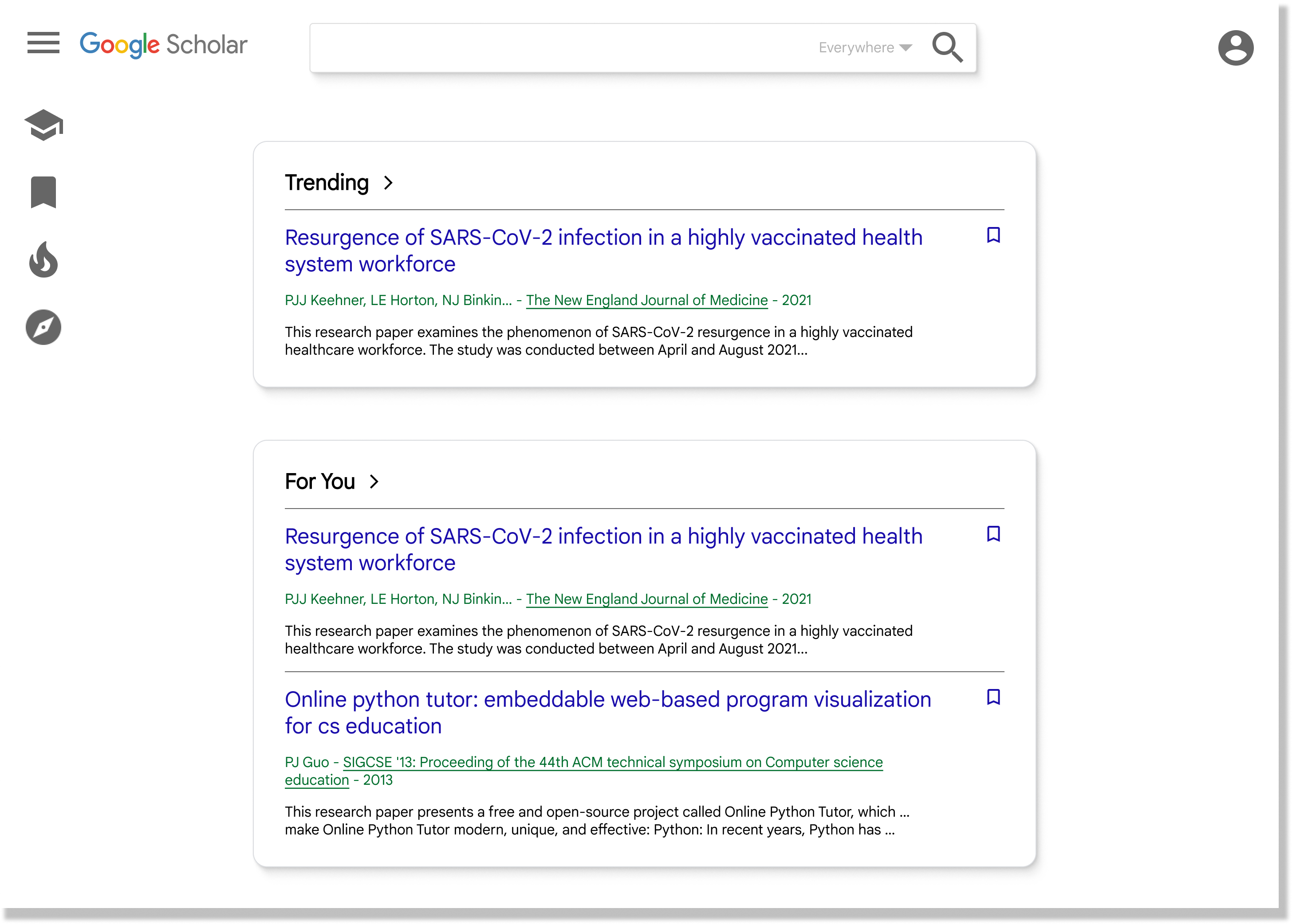
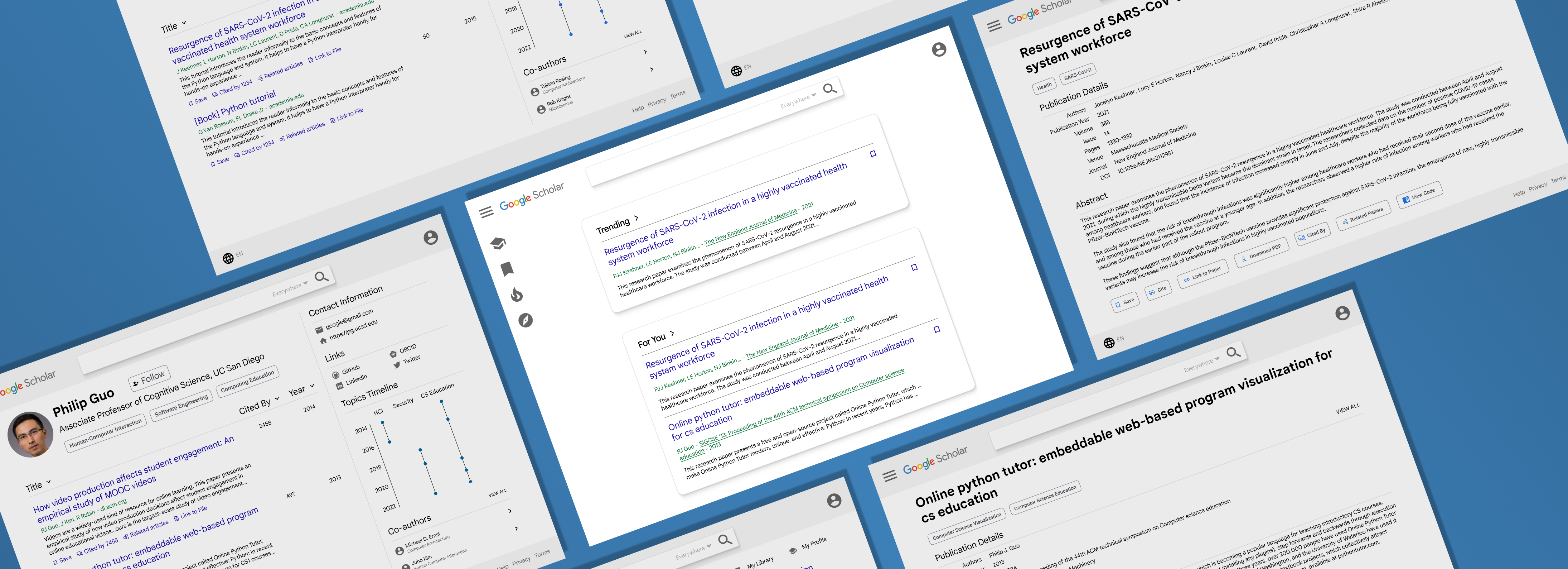
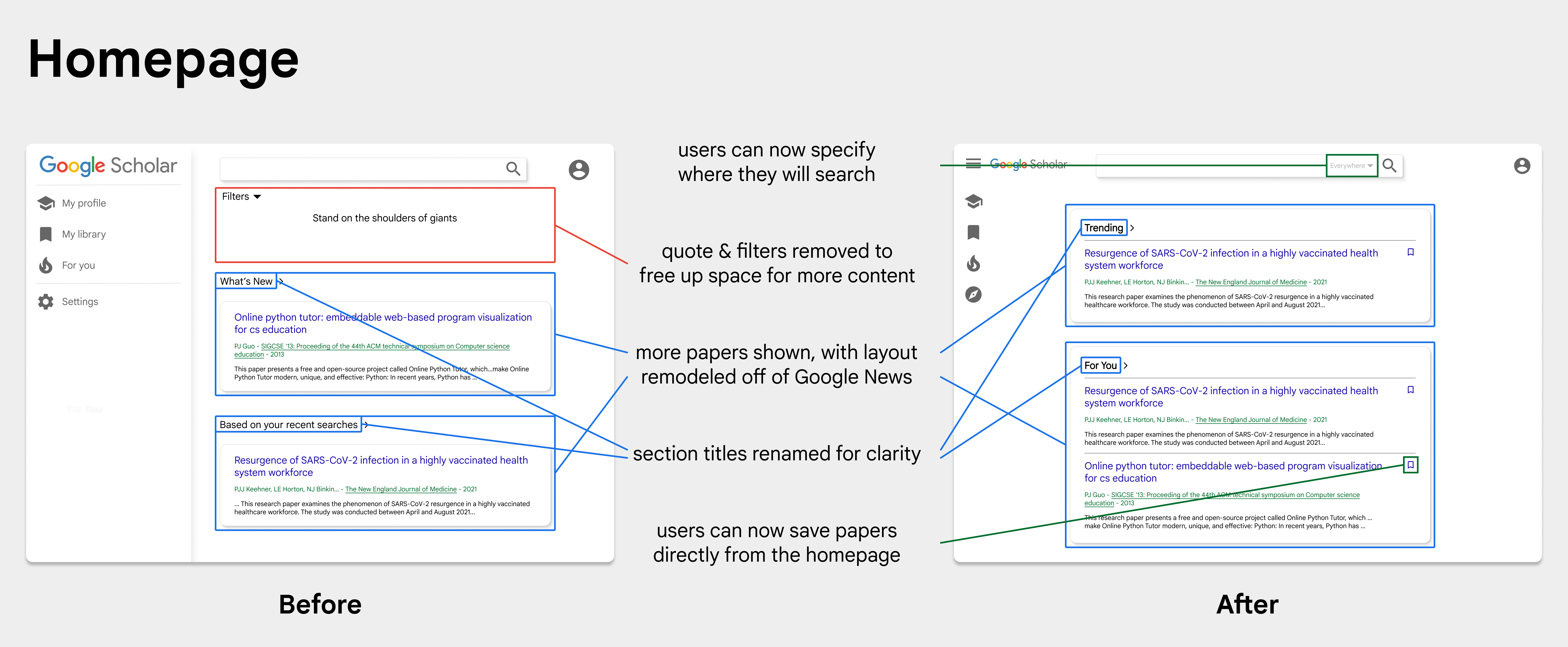
Home Page:
Our home page reflects the user's need for curation, showing them papers that could aid them in their search
Our home page reflects the user's need for curation, showing them papers that could aid them in their search
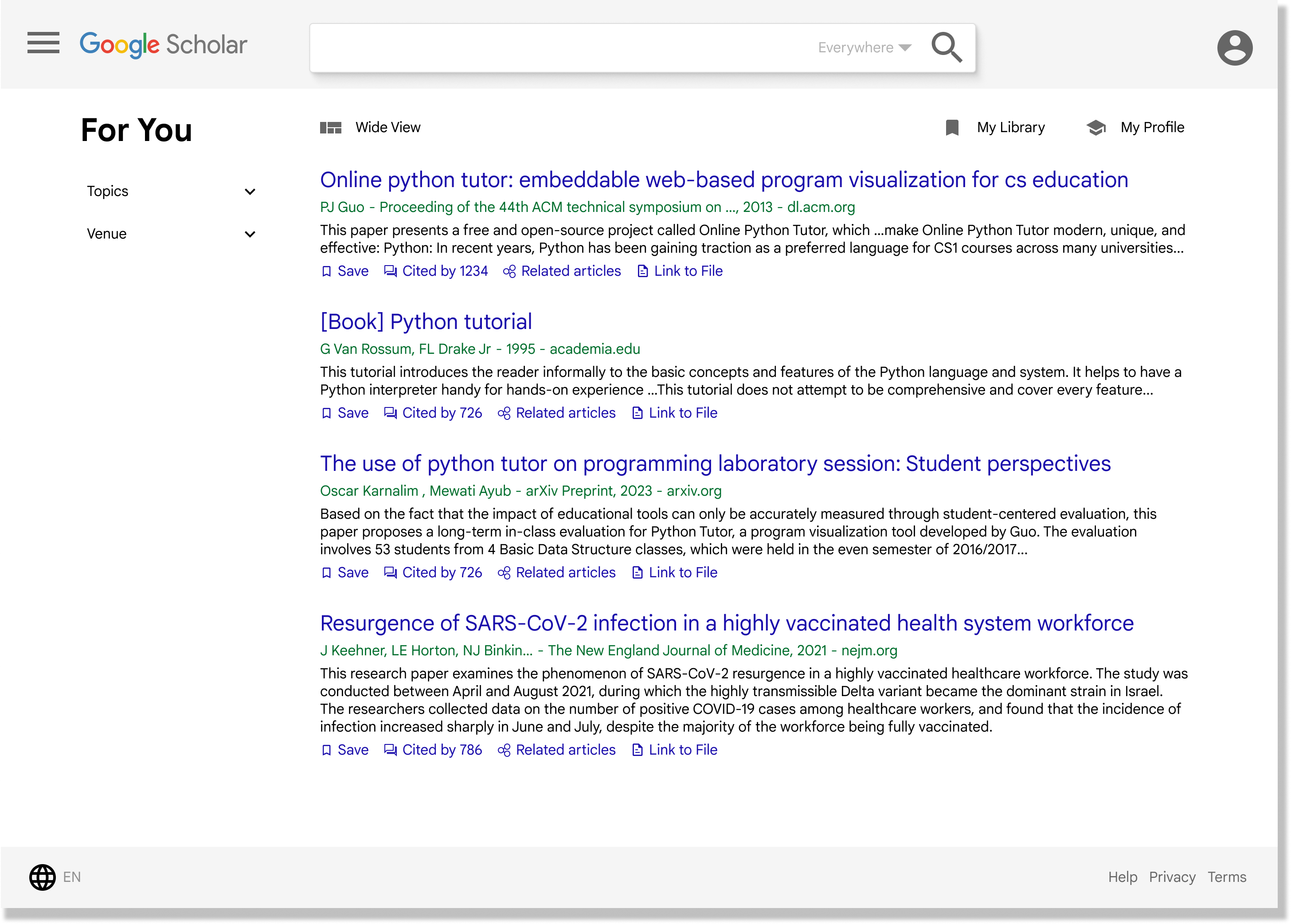
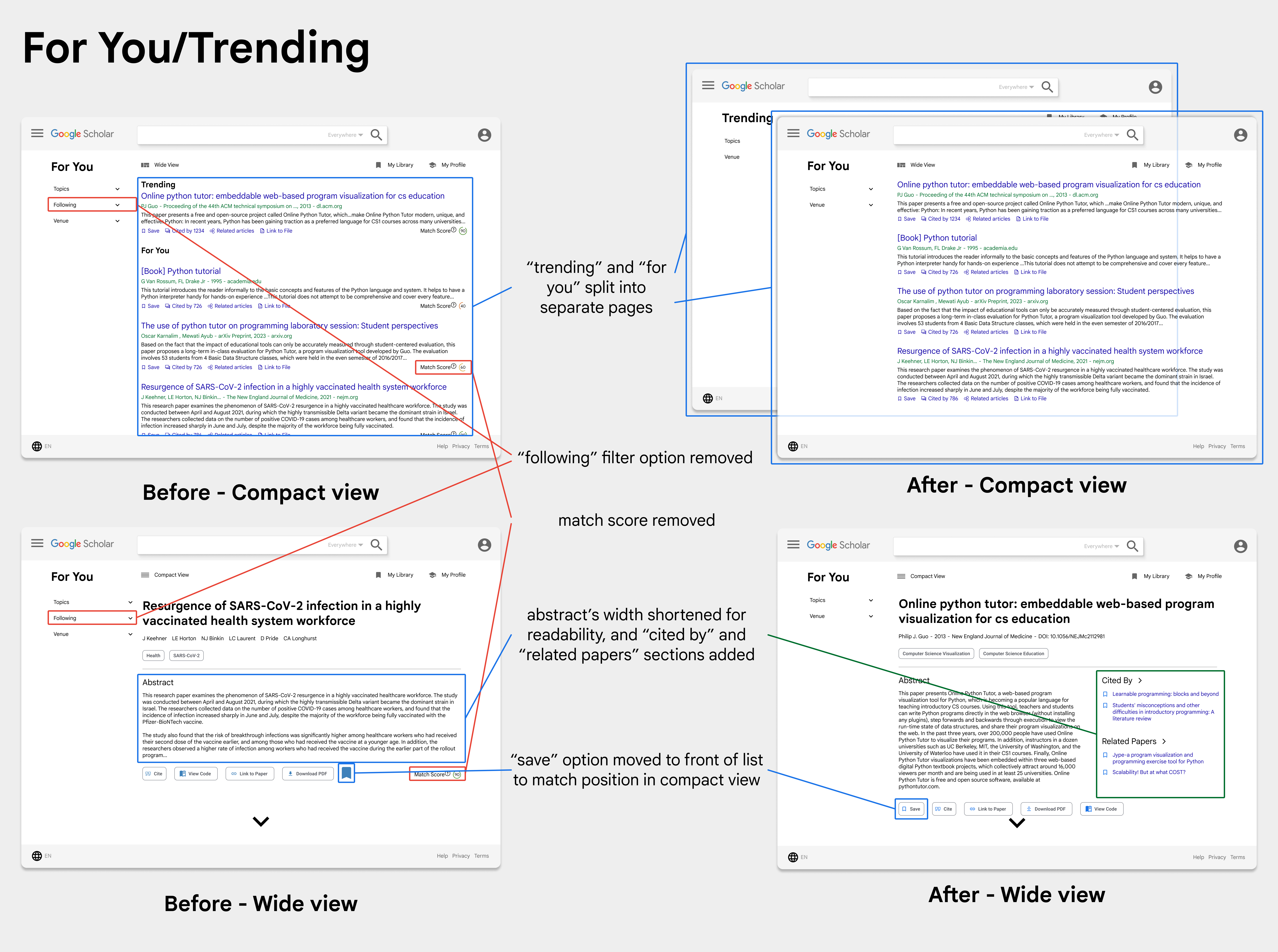
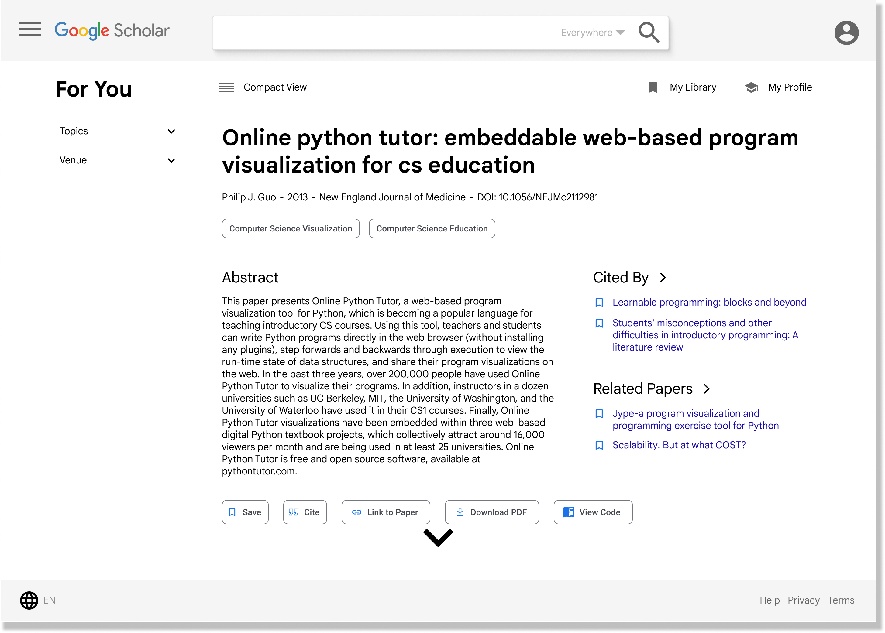
For You Page (Compact and Wide, respectively):
We made two versions of our For You page to accommodate different styles of searching: those who want more detailed information about a paper and those who prefer lists
We made two versions of our For You page to accommodate different styles of searching: those who want more detailed information about a paper and those who prefer lists
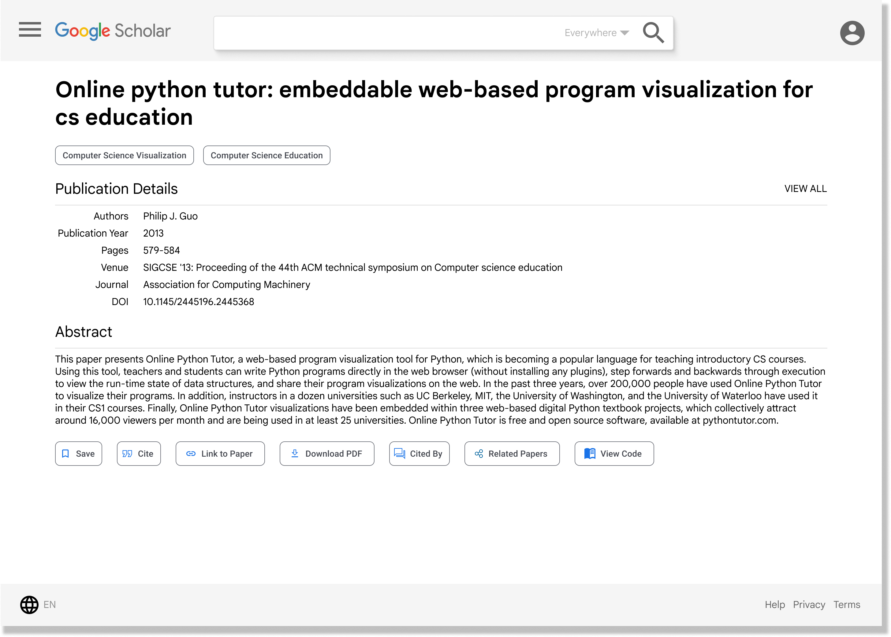
Paper Page:
Our new paper page includes information such as topic and publication details, along with more options like downloading and viewing code
Our new paper page includes information such as topic and publication details, along with more options like downloading and viewing code
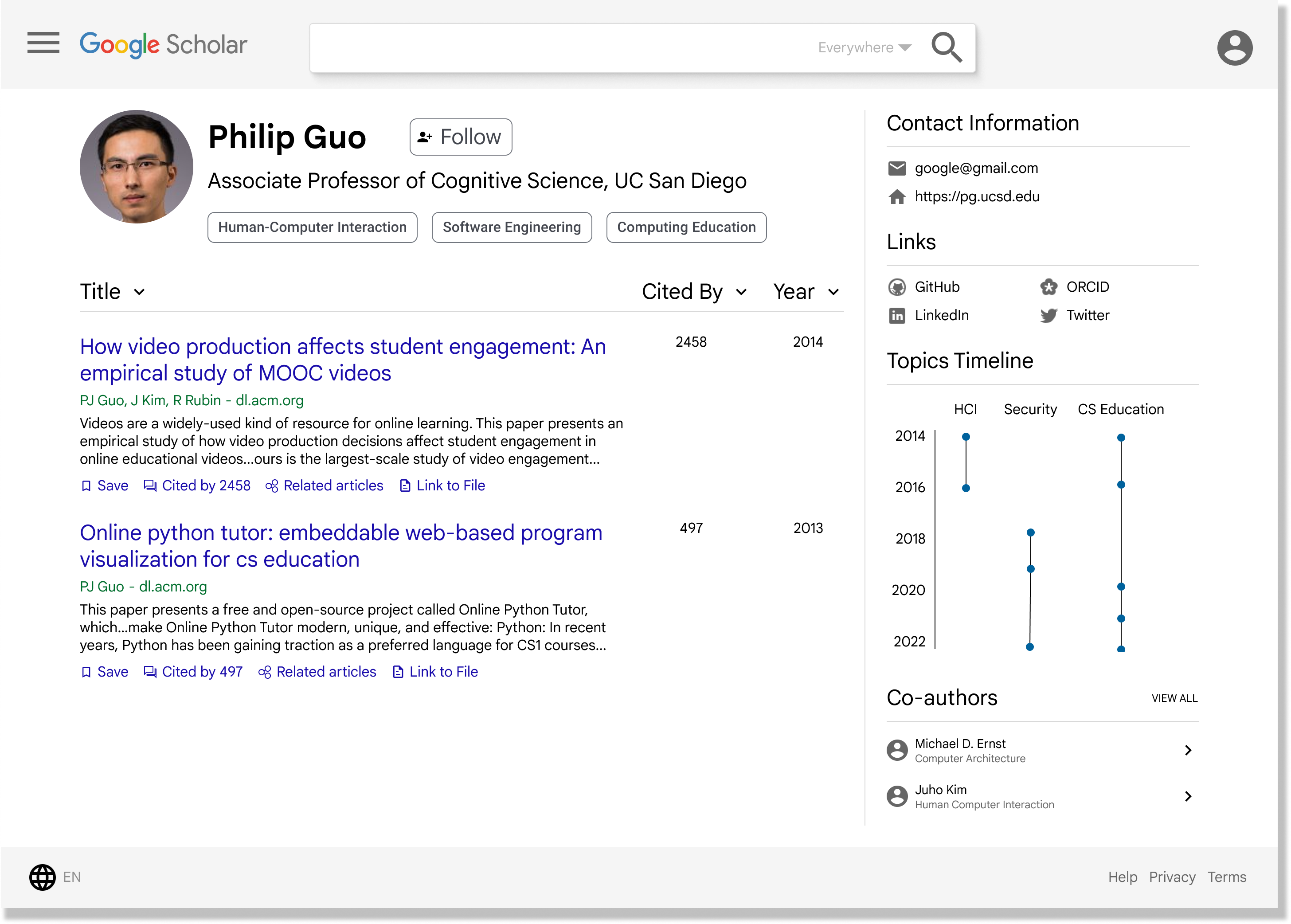
Author Page:
Our author page includes more information like more links and a topics timeline
Our author page includes more information like more links and a topics timeline
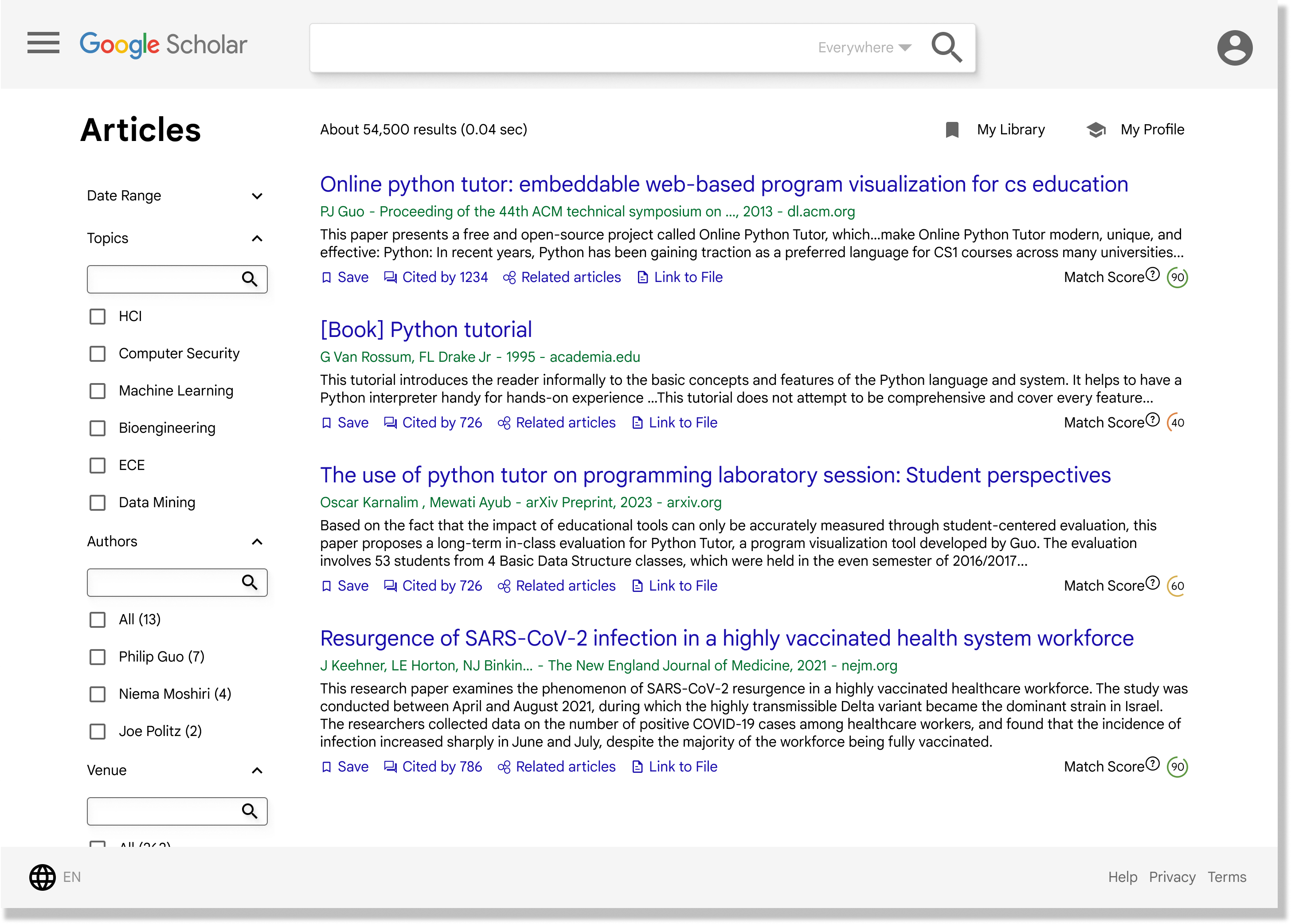
Search Results Page:
Our results page has improved filters with more options and a match score
Our results page has improved filters with more options and a match score
Click here for Figma prototype